
CSS filtering using data attributes
…or how I learned to stop worrying and love markup
 Ellis Kenyő
Recently while trying to update the outdated YouTube cinema mode userstyle to have cinema mode actually fill the viewport and hide the masthead.

The previous implementation hasn’t been updated in around a year or so, so obviously YouTube has changed since then. Sadly, nobody has created a working implementation, though there has been many attempts to do so. The fix was relatively simple, see a snippet below:
#masthead-positioner {
    opacity: 0;
    transition: opacity .2s .3s;
}
#masthead-positioner:hover {
    opacity: 1;
}
.body-container {
    position: absolute !important;
    top: 0px !important;
    left: 0px !important;
    right: 0px !important;
    bottom: 0px !important;
}
.player-api {
    background: none !important;
}
.watch-stage-mode .alerts-wrapper {
    background: none !important;
}
#watch7-main-container {
    position: relative !important;
    top: 85px !important;
    left: 0px !important;
    right: 0px !important;
}
#page-container {
    position: absolute !important;
    top: -50px !important;
    right: 0px !important;
    left: 0px !important;
}
#masthead-positioner-height-offset {
    display: none;
}
 #footer-container {
    display: none;
}
.watch-stage-mode .html5-video-content,
.watch-stage-mode video {
    width: 100%!important;
    height: 100vh!important;
}
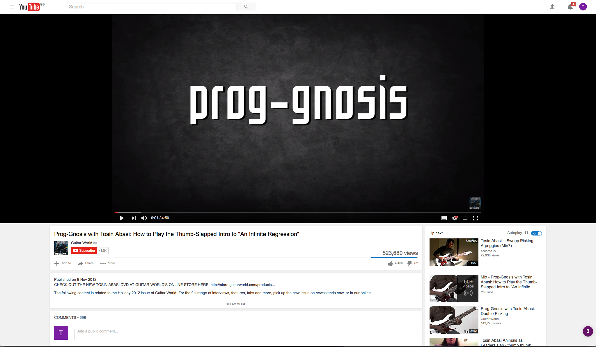
After I fixed it, I was greeted with another issue; YouTube shares DOM elements all over the site and it looked like no way to determine which we wanted to set, which led to the site looking like this:

So in this view we have:
100vhcontent area (not ideal)- Masthead only shows on hover (in this view, not useful)
- Sidebar floats too high (notice the background)
Not good. But how to fix this?
Attempt #1: JavaScript
Seems simple enough right? Create a simple userscript to only apply the styles on *.youtube.com/watch* pages.
// ==UserScript==
// @name                    Youtube Quality Autoplay
// @include                 *.youtube.com/watch*
// ==/UserScript==

...apply styles...
But … this moves the styles from Stylus/Stylish to another plugin. What if you forget to export this when you move to another machine? No, it makes more sense to just include the styles only if you mark them, right?
Attempt #2: Better™ JavaScript
Simple enough again, create a userscript which marks the body with a class, then specify the CSS to only be applied when that selector is present.
body:not(.active-page) > #masthead-positioner {
    opacity: 0;
    transition: opacity .2s .3s;
}

...

body:not(.active-page) > .watch-stage-mode .html5-video-content,
.watch-stage-mode video {
    width: 100%!important;
    height: 100vh!important;
}
This is only slightly better than before, it still depends on the userscript as before. It also carries the same portability issues, and adds a point of failure to this. But, this isn’t our site so we can’t control how it looks.
What if we could do this in CSS?
…
Attempt #3: CSS!
Turns out, the solution is very similar to the previous implementation, but uses data attributes instead. On video pages only, YouTube adds an attribute to the body for internal YouTube-y things.
<body dir="ltr" id="body" class="ltr ... page-loaded" data-spf-name="watch">
This means we can eliminate the userscript dependancy and simply do the following:
body[data-spf-name='watch'] #masthead-positioner {
    opacity: 0;
    transition: opacity .2s .3s;
}
body[data-spf-name='watch'] #masthead-positioner:hover {
    opacity: 1;
}
body[data-spf-name='watch'] .body-container {
    position: absolute !important;
    top: 0px !important;
    left: 0px !important;
    right: 0px !important;
    bottom: 0px !important;
}
body[data-spf-name='watch'] .player-api {
    background: none !important;
}
body[data-spf-name='watch'] .watch-stage-mode .alerts-wrapper {
    background: none !important;
}
body[data-spf-name='watch'] #watch7-main-container {
    position: relative !important;
    top: 85px !important;
    left: 0px !important;
    right: 0px !important;
}
body[data-spf-name='watch'] #page-container {
    position: absolute !important;
    top: -50px !important;
    right: 0px !important;
    left: 0px !important;
}
body[data-spf-name='watch'] #masthead-positioner-height-offset {
    display: none;
}
body[data-spf-name='watch'] #footer-container {
    display: none;
}
body[data-spf-name='watch'] .watch-stage-mode .html5-video-content,
.watch-stage-mode video {
    width: 100%!important;
    height: 100vh!important;
}
That was easy!